Teams frequently underestimate the timeline for UI/UX design because they conflate visual polish with user experience. They see a beautiful mockup and assume the underlying research, interaction flows, and technical feasibility have already been addressed. This oversight often leads to scope creep, rework, and missed deadlines as fundamental user needs or system constraints emerge late in the process, turning what was hoped to be a quick visual refresh into a complex architectural redesign.
Week 0: Pre-flight
Before any design work begins, ensure these artifacts are readily available and validated. This preparation is critical for an efficient 30-day sprint. Missing any of these items will immediately push the project into a longer timeline.
- Clear Problem Statement: A concise, agreed-upon definition of the specific user problem or business goal the UI/UX design aims to solve. This should be quantifiable where possible, e.g., "Reduce customer support tickets related to password resets by 25%."
- Defined Target Audience: Detailed personas or a clear understanding of the primary users, including their demographics, technical proficiency, motivations, and pain points relevant to the problem statement.
- Core User Flows: A documented, high-level map of the critical paths users will take to achieve their primary goals within the system. This can be a simple diagram or a bulleted list of steps.
- Existing Technical Constraints & Opportunities: A documented list of known technical limitations (e.g., specific database structures, API restrictions, legacy system integrations) and potential advantages (e.g., existing design system components, readily available data).
- Key Performance Indicators (KPIs): Specific, measurable metrics that will define the success of the new design, directly linked to the problem statement (e.g., conversion rate, task completion time, error rate).
- Stakeholder Alignment & Availability: Confirmed agreement from all key stakeholders on the problem, audience, and KPIs, along with their commitment to provide timely feedback during the design process.
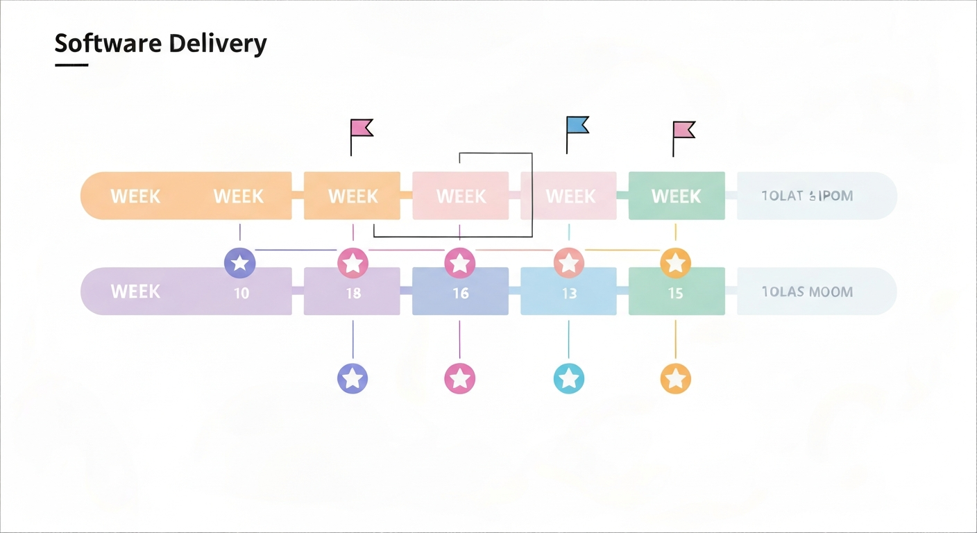
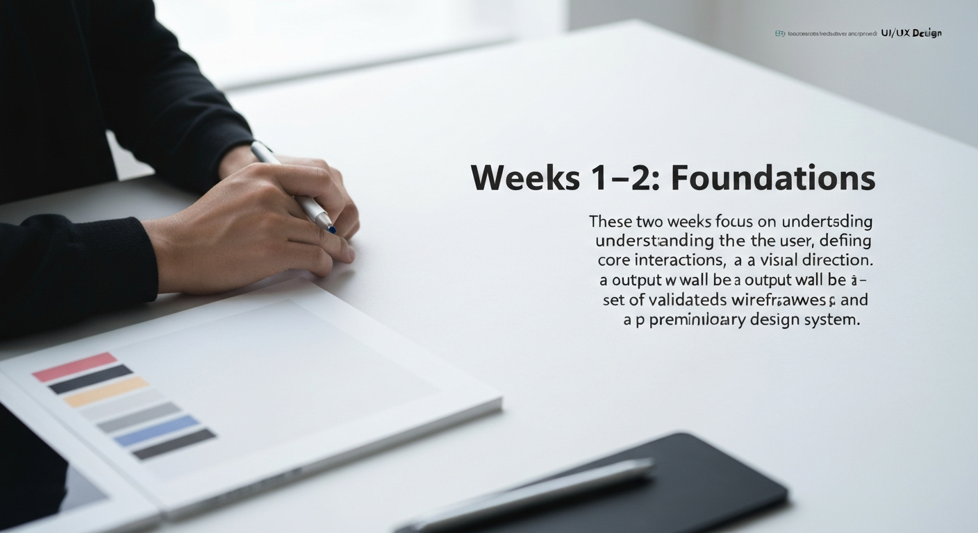
Weeks 1–2: Foundations
These two weeks focus on understanding the user, defining the core interactions, and establishing a visual direction. The output will be a set of validated wireframes and a preliminary design system.
Week 1: Research & Wireframing
- User Research Synthesis (Days 1-2): Review existing user research, analytics, and support tickets relevant to the problem statement. Conduct brief stakeholder interviews to clarify ambiguities. If no research exists, conduct rapid qualitative interviews (3-5 users) to gather initial insights.
- Deliverable: Research synthesis document (1-2 pages) outlining key user pain points, needs, and opportunities.
- Information Architecture & User Flows (Days 3-4): Refine the core user flows identified in Week 0. Map out the screens and decision points required for users to complete key tasks.
- Tools: Miro, Figma (FigJam), or even simple whiteboarding.
- Deliverable: Detailed user flow diagrams.
- Low-Fidelity Wireframing (Days 5-7): Create basic, skeletal layouts for the most critical screens based on the user flows. Focus on content hierarchy, interaction points, and major components, not aesthetics.
- Tools: Figma, Balsamiq, or Sketch.
- Deliverable: Annotated wireframes for 3-5 core screens.
Week 2: Interaction Design & Visual Direction
- Wireframe Review & Iteration (Days 8-9): Present low-fidelity wireframes to stakeholders and a small group of target users for feedback. Iterate quickly based on input.
- Deliverable: Revised low-fidelity wireframes.
- High-Fidelity Prototyping (Days 10-12): Translate the validated wireframes into interactive prototypes, adding more detail to interactions and micro-animations. Focus on the primary user journey.
- Tools: Figma, Adobe XD.
- Deliverable: Interactive prototype of the core user flow.
- Visual Design Language (Days 13-14): Develop a preliminary visual design direction. This includes defining a color palette, typography scale, iconography style, and core UI components (buttons, input fields). Leverage existing brand guidelines if available.
- Tools: Figma, Sketch, Adobe Illustrator.
- Deliverable: Mini design system (style guide) with core visual elements and 3-5 key components.
Weeks 3–4: Shipping the First Slice
This phase focuses on refining the design, preparing for development, and ensuring user acceptance. The goal is to deliver a production-ready design for a minimal viable product (MVP) slice.

Week 3: User Testing & Refinement
- Usability Testing (Days 15-17): Conduct moderated or unmoderated usability tests with 5-7 target users using the interactive prototype. Identify pain points, areas of confusion, and opportunities for improvement.
- Tools: UserTesting.com, Maze, Lookback.
- Deliverable: Usability test report with prioritized findings.
- Design Iteration & Specification (Days 18-20): Based on usability test findings, refine the prototype and design system. Begin documenting specific interaction behaviors, edge cases, and accessibility considerations.
- Tools: Figma, Zeplin.
- Deliverable: Updated interactive prototype, preliminary design specification document.
Week 4: Handoff & Preparation for Development
- Final Design Review & Approval (Days 21-23): Present the refined design to all key stakeholders for final approval. Address any remaining feedback.
- Deliverable: Stakeholder-approved high-fidelity designs and prototype.
- Developer Handoff Package (Days 24-26): Organize all design assets, specifications, and prototypes for development teams. Ensure components are clearly named, states are defined, and necessary redlines or measurements are provided.
- Tools: Figma (Developer Mode), Zeplin, Storybook (for component libraries).
- Deliverable: Comprehensive design system (components, styles, usage guidelines) and developer-ready files.
- Post-Launch Strategy (Days 27-28): Define how the team will collect feedback and measure the success of the initial launch against the KPIs established in Week 0. Plan for immediate post-launch iterations.
- Deliverable: Post-launch feedback loop plan.
Signs You're a 30-Day Project / Signs You're a 90-Day Project
Signs you're a 30-day project:
- You have a single, well-defined problem to solve for a known user group.
- Existing brand guidelines and a technical foundation (e.g., component library, established APIs) are already in place.
- The project involves optimizing an existing flow or adding a contained new feature, not a complete overhaul.
- Stakeholders are fully aligned on scope, goals, and are readily available for rapid feedback.
- The team has direct access to 5+ target users for quick validation.
- The output is an MVP slice, not a complete product.
Signs you're a 90-day project:
- The problem statement is broad, ambiguous, or involves multiple user segments with conflicting needs.
- No existing design system or brand guidelines exist, requiring design from scratch.
- The project involves redesigning a core system, introducing complex new interactions, or integrating multiple disparate services.
- Stakeholders are numerous, have differing opinions, or are difficult to schedule for feedback.
- User research needs to be conducted from the ground up, requiring recruitment and extensive qualitative/quantitative studies.
- The project requires developing entirely new technical capabilities or overcoming significant legacy system constraints.
After shipping the first slice, maintain momentum by establishing a continuous feedback loop. Implement analytics to track the KPIs defined in Week 0 and collect direct user feedback through surveys, in-app prompts, or dedicated feedback channels. Prioritize iterative improvements based on this data, continually refining the user experience and expanding functionality in subsequent, smaller sprints. This agile approach ensures the design remains responsive to user needs and business goals beyond the initial launch.